

Ikvar
-
Posts
417 -
Joined
-
Last visited
Content Type
Articles
Profiles
Forums
Gallery
Events
Downloads
Posts posted by Ikvar
-
-
I dont know if I am just to desperate to use this model, but what about the female knight in this box, and then put some big wings on her under the cape? ^^
http://shop.kingdomdeath.com/collections/in-stock/products/warlords
-
Alright, so I am sure that Wyrd are more then aware of what people think about the miniature at this point, so please keep this tread clean of negative comments about the current Nekima model.
This is in all its simplicity a thread to find a good proxy for our beloved demon woman, as I am having very bad luck at finding a proper figure that fits her

-
I have used quite a lot of time on the Nekima model, and I am slowly coming to a very hard but very simple realization... I am simply not having fun painting her. There are so many details on her, but everything is just to small, there are no room to have fun, and the face is a mess because of the small toothpick tongue and... well the small everything besides those boobs >>
I am still not 100% sure if I will give up and buy a proxy, but I am damn close to do it :/
-
Thanks for all the great comments, there sure are a lot for me to take in ^^
Remember though as I have said a couple of times, I have only briefly worked on things like the NMM, bandages etc on Killjoy, my focus for now have been the skin. He also has many month of work ahead of him, and things like blood, and other effects is something I will only add at the very end.
So again, I am very grateful for you guys taking your time and write all that, but the Killjoy model is VERY early WIP, and I only posted pictures of him to get comments on the colours I have used for the skin
@Tinweasel I am a bit curious, where exactly have you won your Golden Demons, and what category?
- the picture you have posted, is that one of your models that won?
-
 1
1
-
-
Wait wasn't this whole thread on being too sensitive to comments?
I feel like this comment is meant for me, though I am not sure how? ^^
-
@Linus the colours I have used for Killjoy had nothing to do with who I want to play him with... though I do see your point, with the whole purple thing I have going on with my Neverborn crew ^^
@Math I see what you mean with darker shadows, I will work on that asap
I am not sure what you mean with the bandages though, I am simply following the lines that have been sculpted?
- I have been told that I should try to change the colours of the bandages a bit though, as he said the colours are warm on warm atm in comparison to the skin.
and a really good point with the face and general lack of focus, I will definitely need to see what I can do about that
And again thank you all for the great comments, I have really learned a lot since I started this painting blog, you guys truly help me to be a better painter! <3
-
I think you're vastly oversimplifying. I could take a week on one model (and I have), but I don't have the skill to get to the next level. That extra twenty hours of work? It's wasted when there is no big difference. I watch tutorials, I study techniques, and I practice. I'm just so naturally untalented that I'm almost catching up to people who started a month ago.
Now, i do say, and stand by, AWP isn't the place to give unsolicited advice. If people want criticism they'll ask for it. If they just want to share their accomplishment, let it be.
And I think it is amazing how much you want to convince me that you suck, and that there are no hope for you...
In any case, seeing as most people I have been meeting on AWP are like you, I think I will just delete the page on FB and leave you guys alone.
-
1
-
-
Well the huge amount of time I spend on my models pretty much reflects how new I still am in this hobby, I make so many mistakes, and paint everything on my models multiple times for it to work. I hope and expect the time I use on the models to go down a bit the longer I paint
-
See, if you're taking months on a model then brava for you. I'm going to assume you're talking showcase models, because if that's what you consider tabletop I'd be amazed if you ever got a game in. You're arguing from a vastly different position and I'm pretty comfortable assuming you're the outlier.
And you can drop the hyperbole. No one is asking for candy coated kisses. I'm simply suggesting that, in a casual place like AWP, you should save criticism for people who are looking for it.
But, to return your snark, you'd rather insult people for not taking a year and a half to paint a starter.
I paint all my models to that standard and within that time frame, but I am not criticising anyone for not doing the same, I am simply pointing out the fact that you cant expect the same results as what I do, if you only use 5hours on a model. Many people who claim they are bad at painting or drawing, simply needs to use more time on their work for better results- they are not bad painters, just way to impatient.
Actually that was not what you said, or what I reacted on. This is what you said:
"Posting in AWP shouldn't, and isn't, the place for that."
That is basically telling everyone to STFU unless you want to praise the miniature, and that was what I reacted on.
And the last line really puzzles me... do you actually consider polite and constructive criticism as an insult?
- when have I insulted anyone for not painting a miniature for "a year and a half"?
-
I've never posted anything I've painted out of sheer terror. I've spent three years struggling to learn some methods-painting does not come naturally to me. I'm not visual at all and have never been able to do anything in any manner resembling pretty. I force myself to improve, but my brush control is awful, I have no gift with color choice and I'll spend five hours to get a model to table top quality.
Am I proud of my work? You bet. Am I am artist? Not by any definition of the word. People brave enough to post their accomplishments should be lauded for their efforts. If you want critique you'll go looking for it. Posting in AWP shouldn't, and isn't, the place for that.
First of all, you saying that you use 5hours on a model tells me quite a lot, I can use 5hours just priming and getting the base colours on, a model can takes me several month to finish

... so you are telling me that everyone on the AWP side are so insecure that even the smallest suggestion will be frowned upon- no matter how kind I try to be, I am NEVER to do anything my praise their pictures and kiss their feet as the new big thing?
And I know I am not being very diplomatic right now, and I am sorry for that, but that last thing you wrote kinda tickled me all the wrong places...
-
1
-
-
I knew you guys would have a problem with the purple ^^
Dont mind if it looks like his skin is bruised though, kinda had it in mind while I was painting as well, without it being exactly the goal... if you know what I mean
But it is pretty hard to explain my line of thought when I paint- I come from painters background, and even though I mostly painted humans I still threw lots of weird colours on the canvas.
This is an example from when I was 18, the canvas is around 2m in length and 1,5 meters high so you loose a lot of the impression on a small picture, but you should get the idea ^^
 old painting by Jonas H.H, on Flickr
But maybe if I take down some of the purple a little, and paint a more violet gradient between the green/brown-ish colours?
Edit: oh and I am going to try him out in my Lilith crew
-
1
-
-
As promised here are some VERY early Killjoy pictures, as I will be taking a break from him, and start on Nekima instead. What I would really like you guys opinion on is his skin- he started out with just boring green skin, but when I was almost done I thought that it was just to simple and boring for me. Everything else on the miniature I have only painted for a few minutes, I especially dont want to much criticism of his base, as I have barely done anything to it, other then painting the base colours in 10sec.
I also know that his skin needs a lot more glazing to get better gradient, but that will come next time I start with him
So are the colours a bit much?
and do the colours go well with each other? as it seems that is something I am not always to good at.
As I final question I will ones again ask for help with the photo background, I never know which one to use- if it needs to have some of the same colours as the miniature (kinda what I have done with these pictures), or does the background need to be in sharp contrast to the miniature?
- and when should I use a light or a dark background? >>
 Killjoy1 by Jonas H.H, on Flickr
 Killjoy2 by Jonas H.H, on Flickr
-
1
-
-
In Malifaux this is completely irrelevant. The model itself has no bearing on the game. Only the base and it's Ht stat.
Short, cold and relevant as always Ausplosions ^^
-
1
-
-
The head is indeed small... but at least her boobs are huge
-
I simply wont dare to just cut off the tongue, I am really not good at sculpting anything, and will most likely just ruin the face instead >>
I just altered the rock she stand on though, and made it so she leans back a bit, so her face is facing forward instead of down, and suddenly you can see the model a lot better, and actually changes the entire dynamic of the pose into something much better imo.
-
So another thing that bugs me a bit about this model, is the fact that she is not only Crouching but she is also looking down. This means that the only thing you will see of her face when she is on the table is part of her forehead, which really makes me sad as the face is one of the most important things on a model(and it always bugs me when you cant see details I work hard on). Barbaros is Crouching as well, but his head is still fully visible... I REALLY want to like this model, but I can feel that the motivation for using the time I would normally use on a model is slowly disappearing.
But I have promised myself to keep trying(which is also why I made this thread), so I have been thinking of using some green-stuff to push up the front side of the rock so her face will become fully visible... just not sure how that will look with her stance.
Any other suggestions of how to make her face more visible?
-
Alright, so a little while ago I wrote this after priming and pre-shading the new Nekima model:
"An aspect about the Nekima sculpt that I dont think have been mentioned, is how the small size effect all the details on the model. The face fx have so many details, but on such a small spot that I am really not looking forward to starting on the details. I actually think the face is smaller then Lilith face, which is also damn small but has less details. I also hate to work on such a small surface as it gives me way to little room to make the details visible and give it a good gradient which is kinda "my thing". I have no idea how to make the tongue look like anything else then a failed sculpt of the lips, as it is basically just a little bump on her mouth :/And her stance is also a bit weird, the way she bends over kinda looks like she is meant to look down on her opponents- hence the tongue for taunting etc... but because of her size, she is more going to look at the stomach on normal models, and the feets on the bigger models..."And since then I have been working on her... and I have a very mixed bag of feelings about the model.Seeing as there have been so much negativity about this model, I thought I would start with the positive- it is a DAMN good looking model, in fact I think it is the most beautiful and detailed model I have ever worked with. Everything from her detailed stomach to her even more detailed face, this model is truly amazingly good looking!But the problem is that almost all of the details are lost, because they are so damn tiny. And just like I wrote before I started, her tongue is just silly... I simply have no idea how to make that look good or even visible unless you have your face fully up close to the model.So if anyone have any tips on how to paint the tongue, please help me! ^^Other then that, I thought it could be nice to see peoples experience with painting this model, and of course maybe it is just me who are a noob, in which case I am looking forward at being taught by some of you veterans -
Sorry for the wait, but I have been a bit busy
It seems to work quite well, though I am still experimenting a bit. After two layers of glaze on a model that was fully varnished with gloss varnish, it got completely matt. I dont know if the glaze will be easy to rub off though, so I am thinking of maybe trying to put the glaze medium together with a matt varnish?
-
Seeing as I have my black friday stuff now, I have stopped my work on Killjoy for now (will post some pictures of the WIP soon), and started work on Nekima.
An aspect about the Nekima sculpt that I dont think have been mentioned, is how the small size effect all the details on the model. The face fx have so many details, but on such a small spot that I am really not looking forward to starting on the details. I actually think the face is smaller then Lilith face, which is also damn small but has less details. I also hate to work on such a small surface as it gives me way to little room to make the details visible and give it a good gradient which is kinda "my thing". I have no idea how to make the tongue look like anything else then a failed sculpt of the lips, as it is basically just a little bump on her mouth :/
And her stance is also a bit weird, the way she bends over kinda looks like she is meant to look down on her opponents- hence the tongue for taunting etc... but because of her size, she is more going to look at the stomach on normal models, and the feets on the bigger models...
-
First off, where do you live? Not that I want to break in and steal (or use) your hobby setup, just... y'know.. curious.
Is Lilith finished? I have a comment to make but I don't want to if she's done and unchangeable.
As for Graves, I'd say leave the face as-is. If you don't have a lot of detail there to work with, it's better to go more muted than end up accidentally making cartoonishly oversized (or shaped) lips. To me his focus has never really been his face anyway. For him, it's the bulging arm muscles and overall massive size. Now, Tannen on the other hand, I'd argue his focus is probably the face.
Lilith is not 100% done, but even if she was you are more then welcome to give me your critic
I have actually already started work on Graves face, saying that I would not alter anything because of a bad sculpt would only be a bad excuse for me, I will always try to make it as perfect as possible no matter the conditions
-
There is a very simple rules you need to remember i regards to LOS in Malifaux: if any of the models are higher then the terrain, you can see over it- and if any of the models can see the other model, then both will be able to see each other. This also counts for vantage point rules, LOS for dense terrain and everything else. There will never be a situation where only one of the models can see the other... unless they have a specific rule where they ignore LOS or something, like Lilith ofc
-
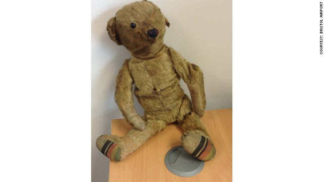
I really like your Teddy, and if it is okay I will be stealing your heart pattern a little bit for my own Teddy
Its quite funny that you ended up painting him with fur though, when I saw this version I thought, "Finally a teddy without all that damn fur!" ^^
So I will try to paint him as a really old teddy style, where they had no fur, and was just some kind of cloth (no idea what the english word is for it). But something like this:
-
2
-
-
Sorry Ikvar and Nighthater, I don't agree, I was thinking the first time I saw your avatar, before you posted this thread that the model looked odd. I think it's well paiinted but the strong bright highlights on the flesh make it look like he is wearing an olive jumper! I'd be tempted to tone it down a bit, with less yellow in his skin. As an aside, I love your thread title! I often ak myself the same thing!!
I always love different views on things, so dont be sorry to disagree with me
If I should expand on what I said before, and if you like the comic book style of painting like I do, I would make the darker spots more dark- if you want to experiment, you could try with some purple glazing, but I have no idea where your general level is, and that might be a bit more advanced.
I might take the whole green tone down a bit as well, this can be done with something like cameo green from vallejo as a glaze over the entire body.
after that you can start build up your highlights- the yellow-ish tone you are using on the figure should work well as a base tone for that, add in some pure white and maybe even a bit more yellow if needed.
As a minimum you should aim for at least three tones (which is the dark, midtone, and highlights I keep mentioning), I was almost not able to see the yellow highlights, this is because there are not enough contrast in the colours you choose. You really need to learn and be more bold with the style you want to paint, and dont be afraid to even use pure white at some of the highlights.
But other then that, I think you are doing really good. It is a very clean figure, which is something most people seem to forget
I have also ordered some gremlins from Black Friday, and will very soon begin to paint some of them, you will be able to see what I mean with the purple shadows and yellow highlights then.
And thank you so much for your compliment, it truly means a lot to me
-
1
-
-
Laika,
This model is well painted. I don't fell you used strong enough highlights, but I'm no master painter. Everything looks kinda dull, and stronger color highlights on the model and the barrel I fell would have given a lot to bring more life to the model. As I get better at painting myself, I realized stronger highlighting made the model.
Hopefully some if the masters psinters on here will chime in, and guide you.
Nighthater
This is spot on, your darks needs to be darker and your highlights need to be brighter on every colour you have on the miniature


Nekima Proxy
in The Neverborn
Posted
Anyone know exactly how big this one is?
http://www.freebooterminiatures.de/en/catalog/43
Is it a good size compared to Malifaux figures?