

Billingsly
-
Posts
3 -
Joined
-
Last visited
Content Type
Articles
Profiles
Forums
Gallery
Events
Downloads
Posts posted by Billingsly
-
-
Thanks for the kind words. I'm glad you all have enjoyed it.
Daddy4count it is digital! Done entirely in photoshop.
-
- Popular Post
- Popular Post
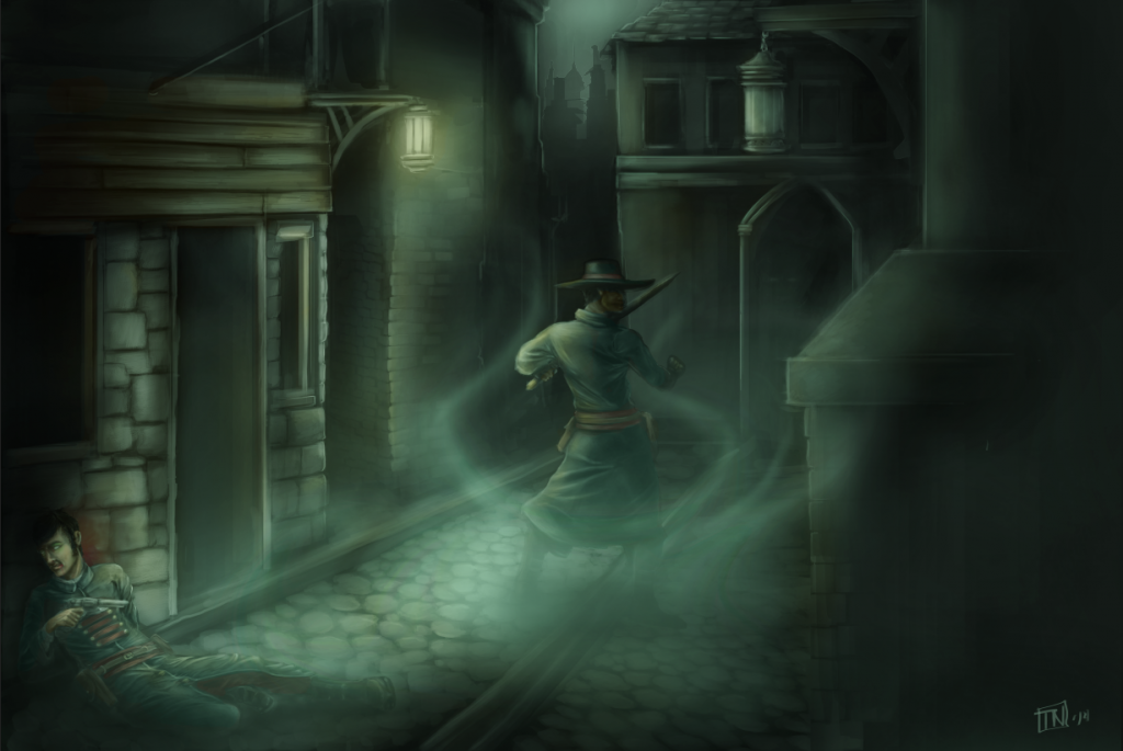
Forgive me if I put this in the wrong location. I couldn't seem to find a place for 'fan-art' so I figured I may as well just put it here.
Anyway this is a little piece I've been working on for about a week (on and off).
Let me know what you think. C&C welcome and encouraged.
-
 13
13

A little picture I drew.
in The Hobby Room
Posted
Hey thanks for the feedback! I always appreciate constructive criticism (only way to improve). Anyway I took your advice and applied those changes. I think the biggest thing was just moving the building. It really improves the composition. Thats clearly something I'll need to look out for in the future. Anyway here's the image with the changes.
Also if any of you have some suggestions for more Malifaux related stuff I'd like to hear them. I can't guarantee I'll draw them but I'll never turn away a good idea.