

Przemas
-
Posts
22 -
Joined
-
Last visited
Content Type
Articles
Profiles
Forums
Gallery
Events
Downloads
Posts posted by Przemas
-
-
it's nicely done but hasn't got the key to my wallet....
... but we`ll keep on searching it mate
 ...
... -
yup, it would fit IG army nicely (and hopefully IG players will find this model useful and worth buying), but the source of inspiration lays somewhere else - pics of regular military .
Here are images of the unpainted mini:


-
I`ve just launched our online store.
Apart from our previous stuff we have 2 new releases:
1.Tox Guardsman heads (first set for our new product range - conversion bitz)


-
that would explain why I like it
 !
!Blind dumbass I am - just noticed that the sculptor`s name is written on the pic
-
Even though I`m noy huge fan of Felix`s sculpts - Love it! And I think it will look great after casting (for me common problem with AoW minis is that they`re suberb before casting, while the completed and casted model looses a lot). The heads on the axe might look better when the hair will be attached (it`s a WIP after all). But I agree those skulls on horns are plain stupid - and ugly.
-
the one thing i`ve found when painting with metallics is that when you apply the first layer it`s best to use a tad thicker paint. so only dilute it slightly, a drop of water will be enough. this way the first layer seems to be smoother and more shiny.
the highlights and shades shouyld be applied normally. i tend to use inks and dry pigments a lot for this.
as for paint recommendations. boltgun metal is for the best basic metallic silver/steel. in this matter i agree with bexley. but i won`t when it comes to golds. definitely p3 golds are the way to go. other manufacturer`s golds have some problems with coverage and doesn`t have funky shades like blighted gold (that being said p3 rhulic gold is still my favourite).
-
saw the Jeremie`s version of it and I must admit it`s freakin great sculpt. Definitely on my "want some" list
-
looks interesting, but i`m not sure it will run on my PC ...
-
@Bexley: the entry got disqualified - i haven`t read the rules carefully and showed some wip pics. I think I`d be able to paint something during the weekend but the deadline was October 31st, am I right?
as I`ve used yellow-purple complementary set on summonner getting the nmm gold wasn`t very hard. hope i haven`t confused you by mentioning that before i made some succesful experiments with red-green set (check my khadoran manhunter skin colour).
there`s one problem i`ve got though - p3 heartfire is very strong yellow that shifts to orange side. nmm with pure heartfire would look cartoonish. i`ve added a tiny amount of purple and black to it to get the tone more to my liking.
-
it`s generally quite impressive what can you do with complementary colours. previously i`ve tried green, red, white, black and it worked nicely as well.
-
to look spectacular
 ? you know "i got bigger sword than yours" sort of stuff ...
 -
wicked - wants one

-
well to be honest when i first started experimenting with colour theory i was quite surprised how much you can achieve with very limited choice of colours too
. mixing paints is fun . here`s how my wet palette looked like when i was finishing skin areas: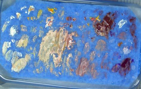
-
here`s the mini i`ve intedneded to enter into rotten harvest but due to being a lazy dumbass and not reading the rules got to remove it
 .
.colours on the pic are a tad messed up - i`ll try to make better photos.

it was an experiment in colour theory for me. i`ve used only 2 colours and 4 paints overall (p3 thamar black, p3 menoth white highlight, p3 heartfire, p3 beaten purple).
-
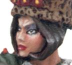
thx for comments. extreme close-up on the face
-
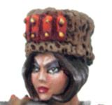
Some pepl easked better pics and more angles
. Here they go: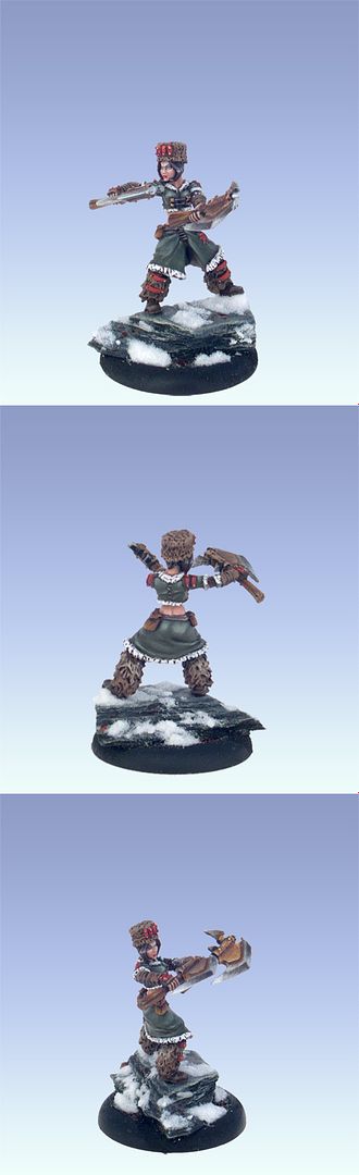
-
looks a bit like a parody of heresy vampire
. lovely mini -
Nathan I should like to introduce Mr Head to Mr Wall.
:laugh:
well, just got a batch of Wyrd minis and definietly they match the scale of the other popular manufacturers. to be honest i was quite surprised when i read that some people can`t see it. i just thought that most of the people know that GW and Reaper are in 28mm nomore.
if you find other idea to describe the models that would be fine. on the other hand it would be cool to keep the exact measurments - i find them nice (don`t know if they`re useful, but it`s good to know what size your mini is
). -
who needs more bugs anyway
? -
.
but please don`t talk about photo editing
.got to agree that this well deserved winner. seen pics of some other entries but none were IMO that cool as this group.
also i think that this minis are ot only top notch when it comes to technique ( typical for Natalya) but also have a "feel" (something that her works sometimes IMO lacks).
-
I could only recommend MSB Toys - their miniatures are so cool and imaginative. Also well casted (at least the ones I have). My only complaint are all spearshafts, sticks etc - they`re incredibly thin and bend waaaaay too easily.
It`s also worth noticing the MSB Toys staff are very friendly chaps
. -
well not only store site looks much cooler now, but the main site after rebuilding is fantastic too (well maybe not so informative and gamer orientated but simply plain pleasure to view)
 ...
... !
! ? you know "i got bigger sword than yours" sort of stuff
 .
.
New Freebooter Mini...
in News, Reviews, & Discussion
Posted
this is the first in a while of the Werner minis that I really enjoy. So full of character. Also nice to see his slightly different approach on the faces .
.